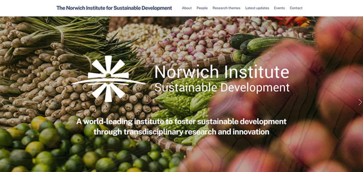
Website and branding: Norwich Institute for Sustainable Development
Starting the branding and identity for a new institute.
I led the branding and visual development of the Norwich Institute for Sustainable Development (NISD).
The NISD is an institute created across the Norwich Research Park to foster sustainable development through transdisciplinary research and innovation. This institute would go on to build on the cross disciplinary links, to build further projects across natural and social science disciplines for societal impact. In its initial phase, it focuses on sustainability changes around food systems.
The NISD was launched in 2020 and required an identity that communicated the transdisciplinary, at scale, impact focused nature of the institute.
I have led all design for the institute, including:
- Logo
- Website creation
- Content creation for the website (copywriting and visual)
- Graphic design and typesetting of reports
- Newsletters
Logo & branding
I wanted the logo for this institute to be simple. Something that visually communicated a bold, strong new beginning, and some hidden depth to the design. I also wanted to draw upon the global nature of the institute.
Based on the above, I created the logo below.

The logo symbolises the sun rising over the horizon as the dawn of a new day and signalling the global,future-looking nature of the institute and a mind for change. Bold, punchy colours outline this dawn, although originally (as seen below) I used a lighter colour for the blue of the logo.
The ‘sun’ in the logo draws on a West African symbol of wisdom, which depicts the many connections of a spider’s web. Much like the efforts of the institute, this symbol depicts that there is wisdom in connections. This felt particularly relevant to the start of the institute, which sought to build new connections, and draw on a wide range of knowledge.

I feel the logo came out well and has served to help build the image for the institute. I matched the colour branding of the site with the same orange, blue and purple, which makes for a striking, high contrast design, if a touch single minded.
Website
After the logo was created, we needed a website. As a virtual institute, spread across a much larger campus, the website presented an important means to build a sense of identity and collate content around the growing activities of the institute.
The website can be viewed here. It runs on WordPress using a custom theme I made with Themify. It uses a minimalist, clear approach with few animations and short sections of text, relying predominantly on images to communicate the topic and scale.
The website follows a standard set of pages, organising new content around news, events, publications and briefings. The Themify theme and plugins make the news and events pages extremely easy and are easily customised to keep a minimal approach.
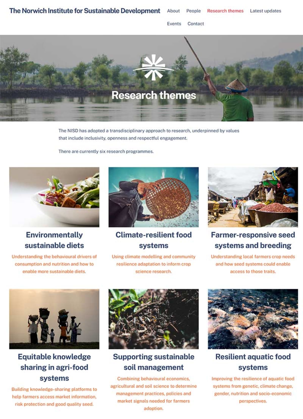
The website is currently in its first version and will be receiving and update in the coming months to redesign the team and research pages.
Typesetting and promotions
The NISD produces two main types of content that require typesetting: NISD briefings and reports. I typeset all NISD documents using Adobe InDesign using my own templates.
NISD briefings are quick documents to share findings from NISD research that might or might not have been published in journals. Often they are quick ways to draw attention to a new findings.
I designed NISD briefings to be a quick, easily accessible template with a professional feel. True to their name ‘briefs’ are straight to the point and short in length, drawing on quick summaries, bulleted sections and pull quotes to quickly communicate the topic.
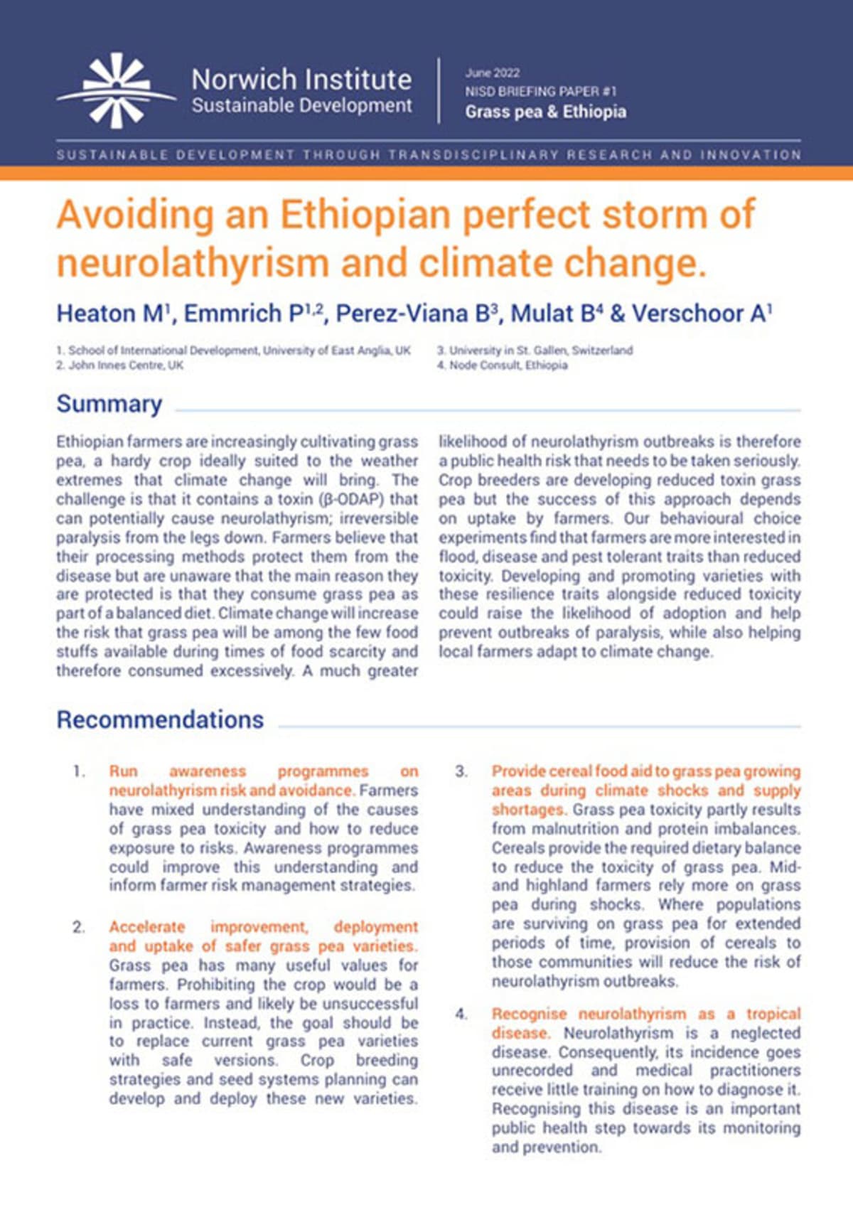
NISD briefs are published online as both PDF and HTML versions, to make them most accessible to users, search engines and AI. The PDF version is also posted on FigShare to create a digital record in another online repository, which also grants a DOI.
Each webpage version on the NISD website uses hash tag anchor linked sections to for linked contents pages within the page and to enable easier sharing of specific sections by URL.
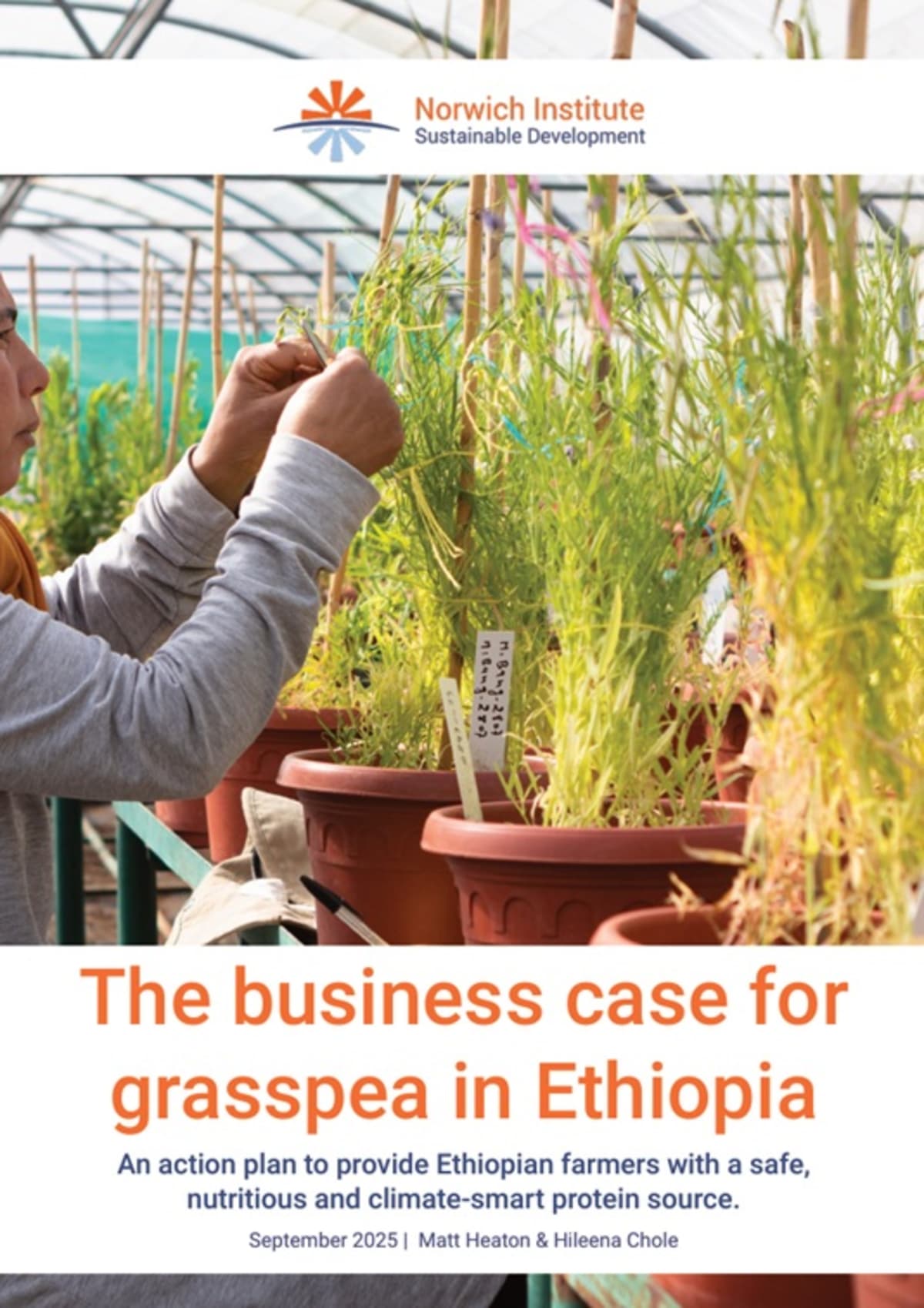
For longer from the NISD that doesn’t go into publications, the NISD publishes reports. For instance, the Business Case for Grasspea was a report I led with Hileena Chloe. Here’s the cover:
Here’s also the contents page:
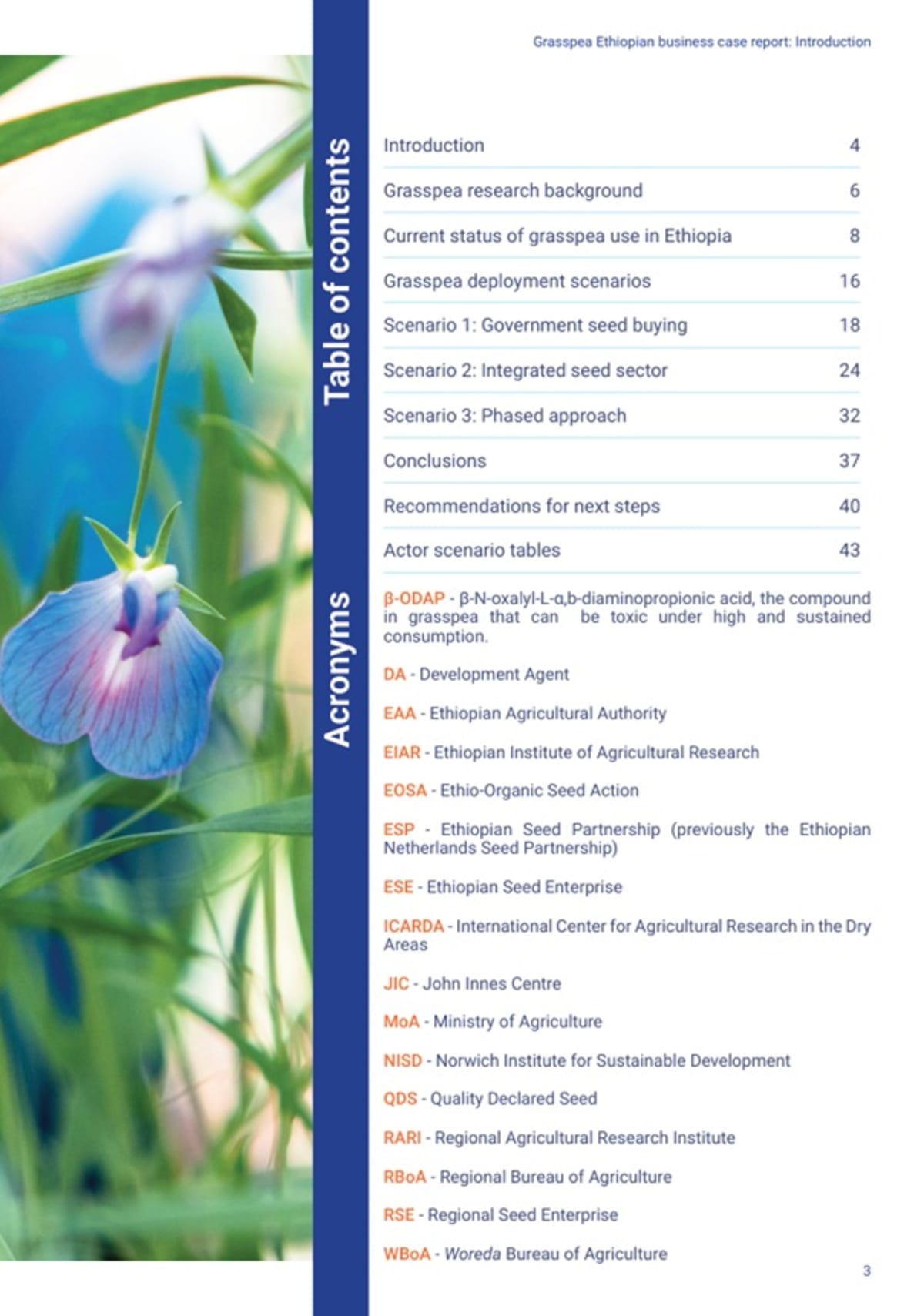
And an example of an inner page.
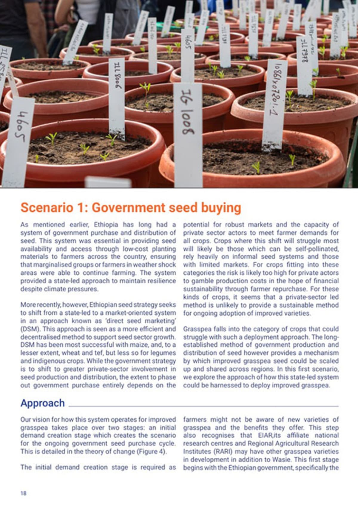
All reports that come from the NISD use a similar style of colour palette, font, headers and design with enough flexibility to give each report its own identity while also carrying some consistency in style.
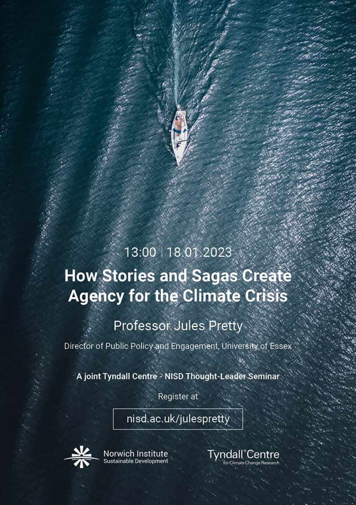
Occasionally I also produce posters for visiting speakers (example below), but these are becoming less common.
Most of our communications come through email messaging. I used to code these in HTML, but now I just make them in MailChimp. Here’s an example of a MailChimp email.